Action menu
Action menu is composed of action list and overlay patterns used for quick actions and selections.
On this page
On this page
Usage
An action menu comprises a set of action list items, where each item represents an action, command, submenu, or the current selection that can be either a single or multi-select. The action menu can be invoked by clicking on a button, icon button, or right-clicking on the list items.
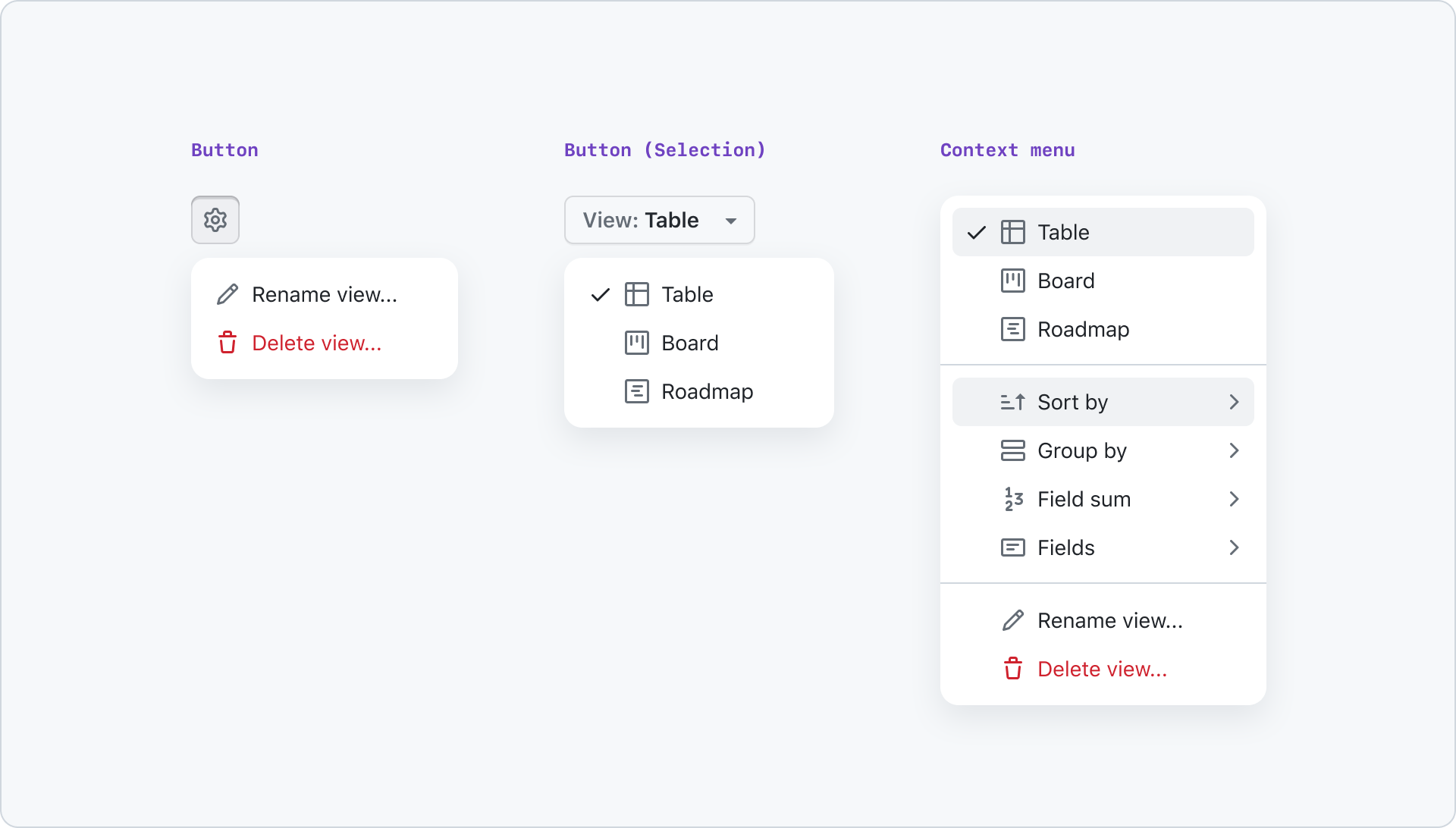
The action menu is an extremely versatile component that is not restricted to a single type of action list items at a time. It can be used to create a combination of single select, multi-select, commands, and submenus.
By using dividers and section titles, a hierarchy can be established within the action menu, making it easier to navigate and understand. This allows users to quickly find and access the actions they need, while also providing a clear and organized structure to the menu.
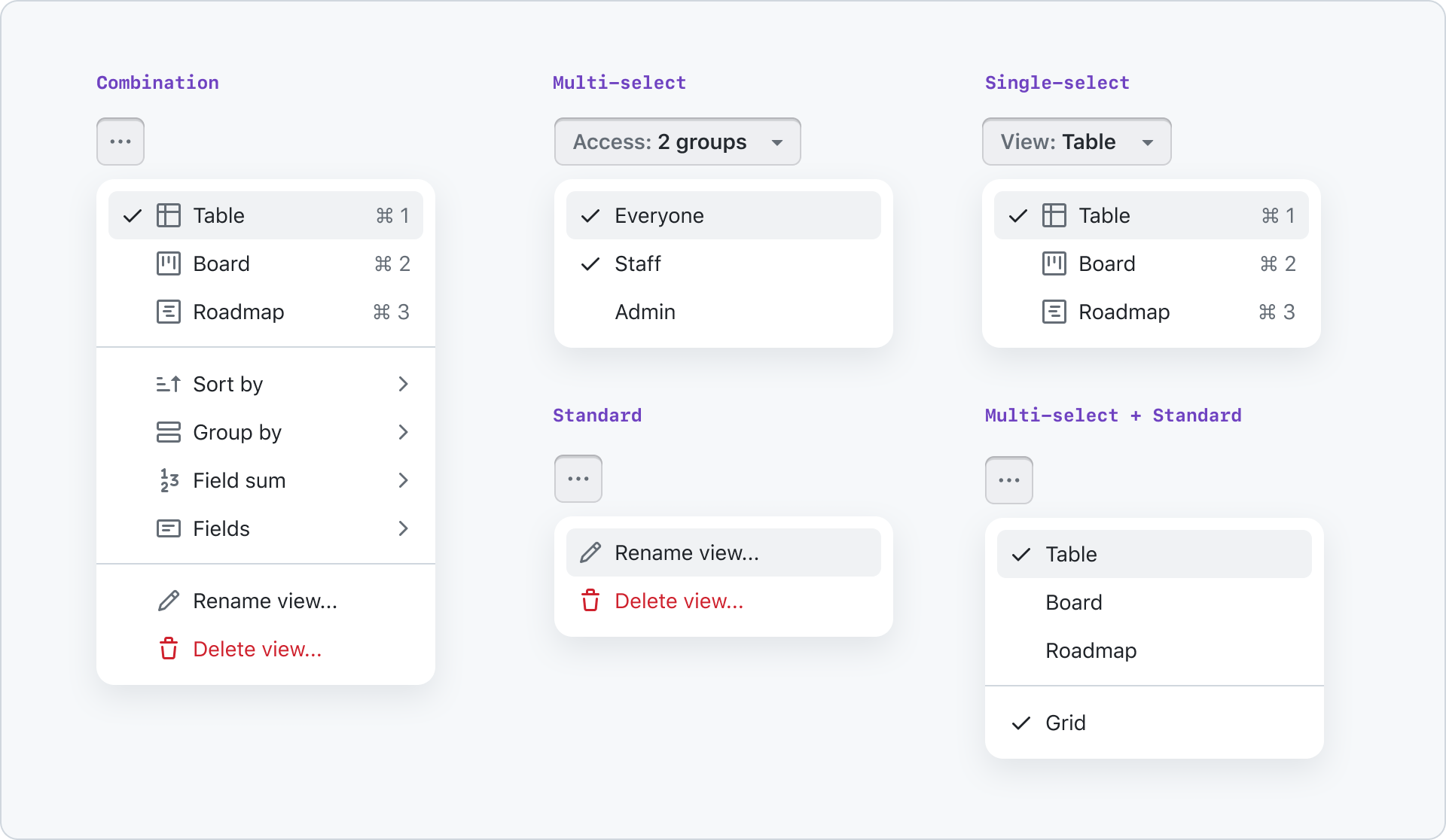
As the action menu is a highly adaptable component, it's crucial to keep the interactions with individual items limited. The following interactions are recommended:
enter,click, ortap: These actions trigger an action or navigate into a submenu, based on the selected item.arrow left,arrow up,arrow down,arrow right: These actions can be used to navigate the menu, allowing the user to move between items and submenus with ease.
Menus are a commonly used feature across multiple platforms, and both Apple and Microsoft have detailed documentation on their menus. To create a pleasant user experience, it's important to follow their expected behavior closely.
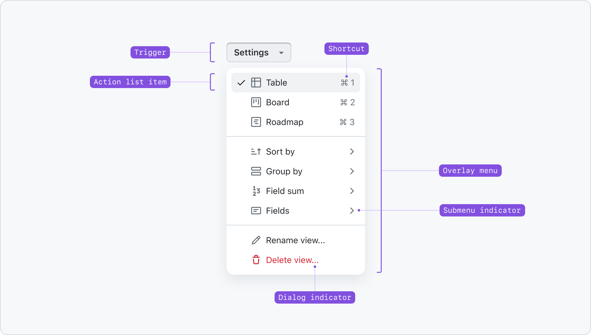
Anatomy
Content
Open
Action menus can be opened through a button, icon button or by right clicking list items that have a custom context menu associated with them.
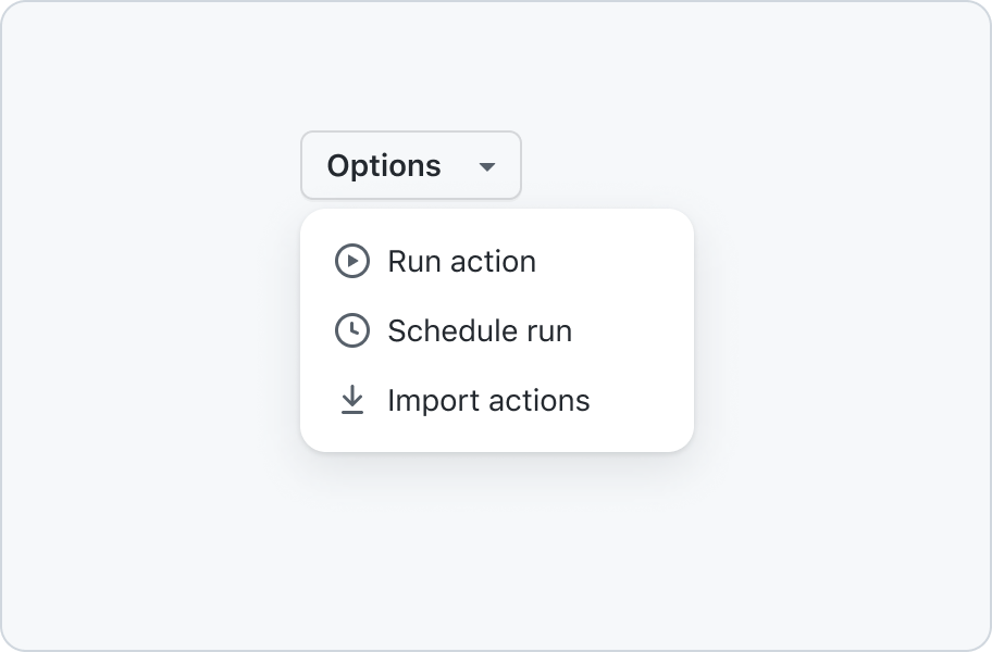
Use a button to open a menu.
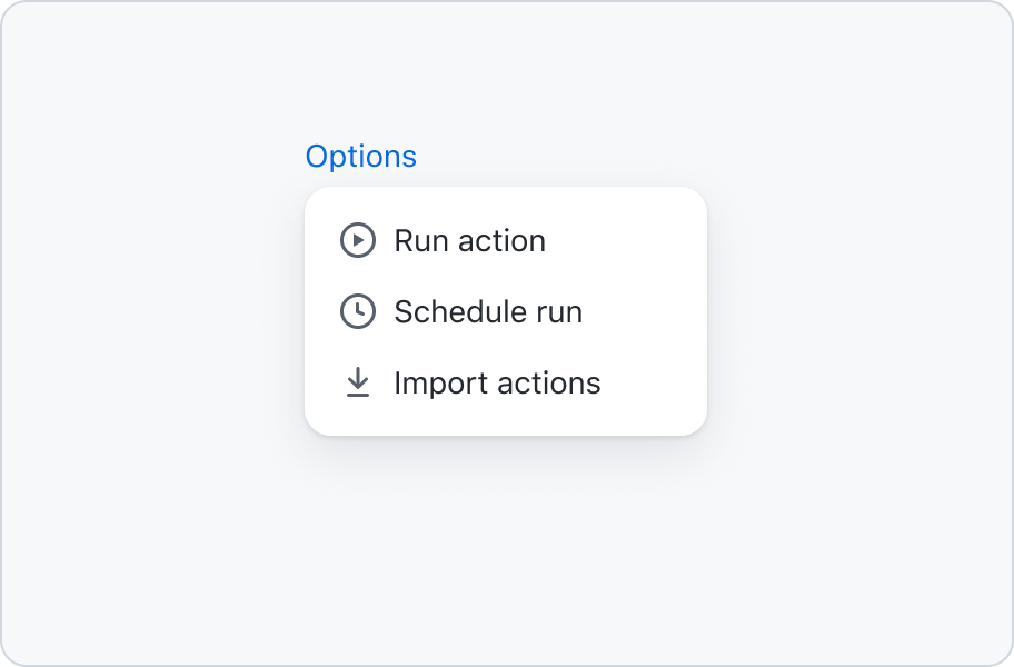
Don’t use a link to open a menu.
When using a button the menu can be opened by clicking or tapping it. When it's focused it can also be opened by hitting return, space or any arrow key.

Open by clicking the trigger button with a mouse
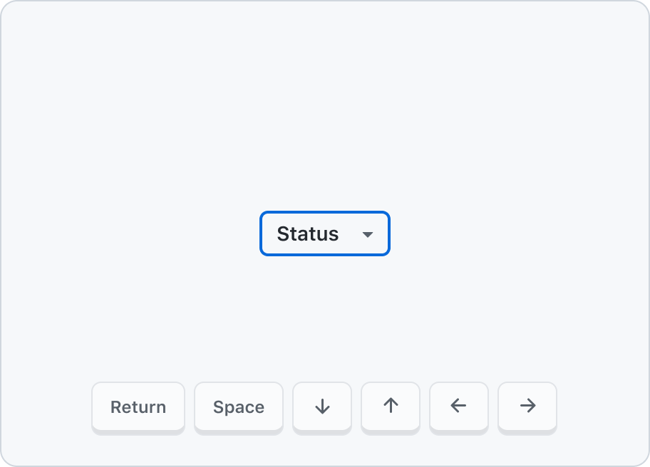
Open by focusing the trigger button and hitting return, space, or any arrow key
Close
The menu will close when pressing the esc or tab key or when pressing enter when a item is focused.
Additionally clicking outside the menu item or clicking on a item will close the menu as well.
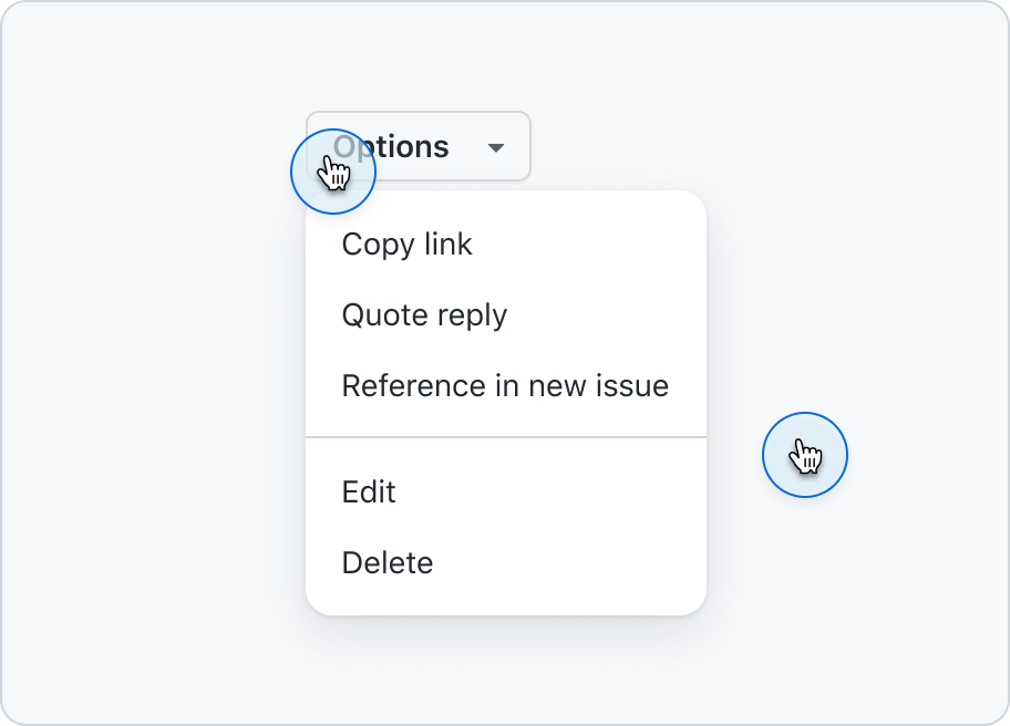
Close the menu by clicking on an item, clicking on the trigger, or clicking anywhere outside the menu.
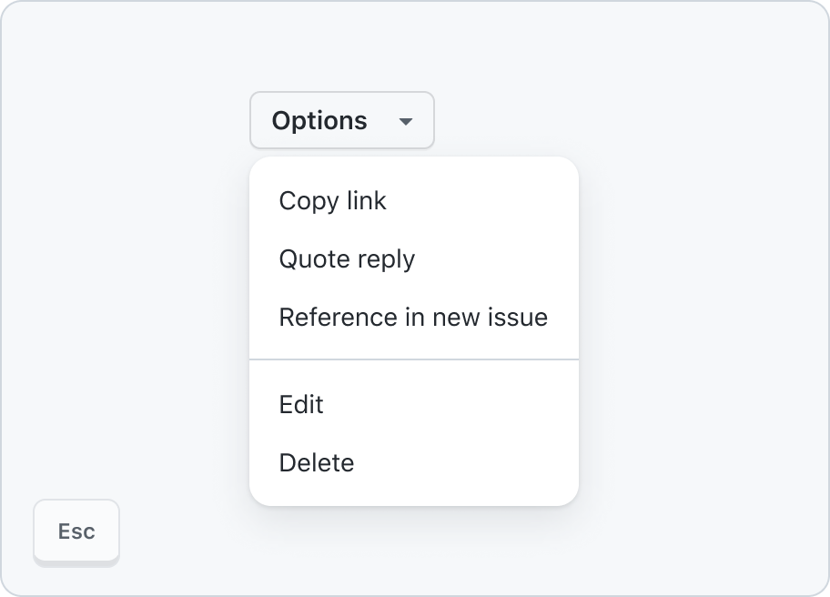
Close the menu by hitting enter on an item, esc or tab.
Single and multi select
Single select menu closes upon selection and may update the button label.
Multi select menu closes upon selection and can be re-opened to select more options.
Avoid input controls
The focus should always remain on menu items, and therefore the menu shouldn't include additional form elements like button, input, or checkbox.
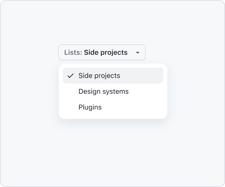
Use action menu for quick actions.
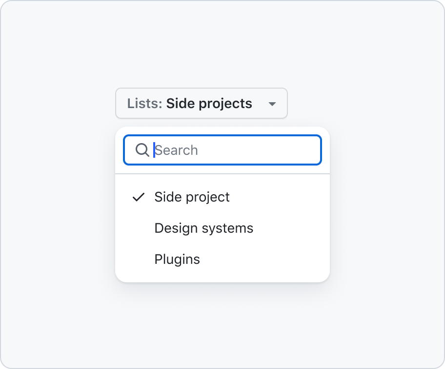
Don't add form controls like a filterable input, use select panel instead.
While single and multi selection is offered within a menu, the underlying semantics are not true form elements.
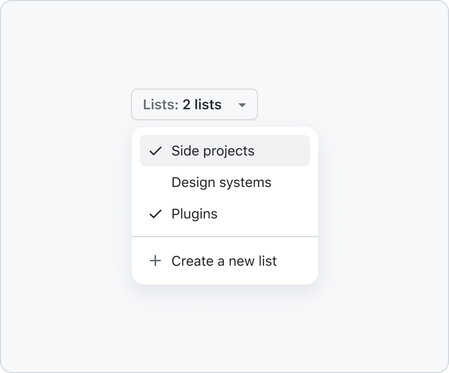
Use a checkmark icon for selections.
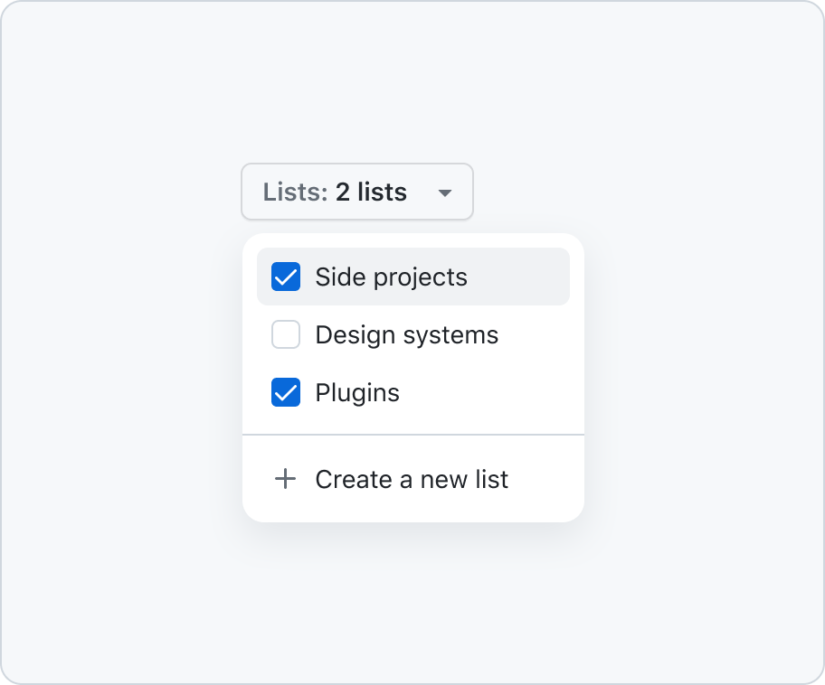
Don't use form elements within a menu.
Alignment
Consistent alignment of icons, titles, and trailing visuals is critical to ensure that the menu is easily scannable. This is especially important when combining single or multi-select items with non-select items.
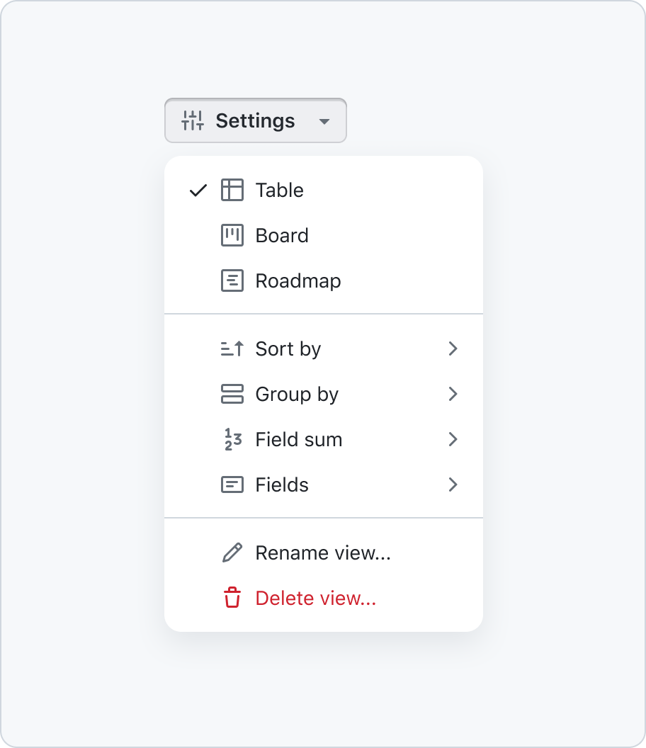
When a menu includes a single select or multi select then all the items in the menu should be indented.
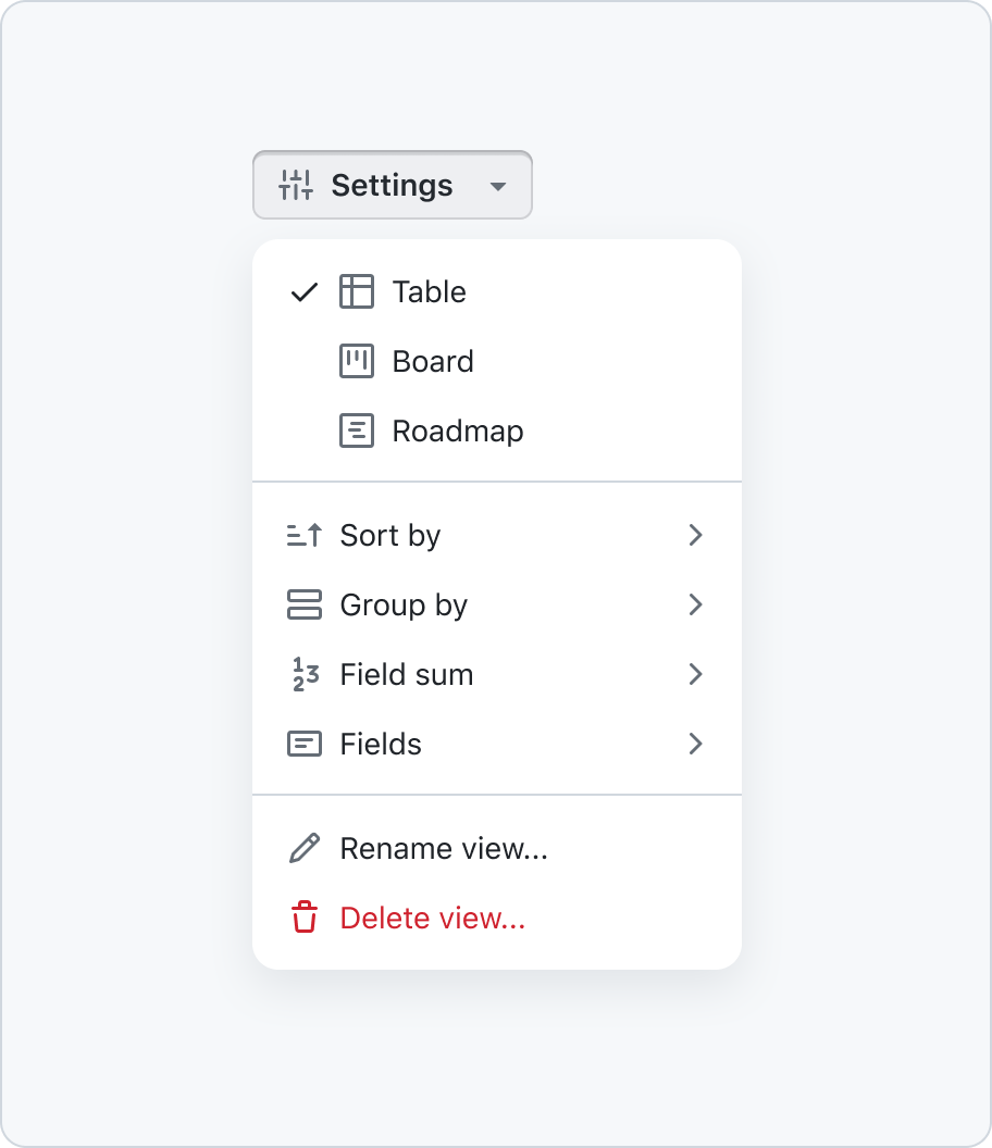
Don't create invidiual alignments when your menu contains a single or multi select.
Icons
When designing menus, it is crucial to adhere to the meaning of the icons used. If any item in the menu does not have a corresponding icon, then all items in that menu should be presented without icons.
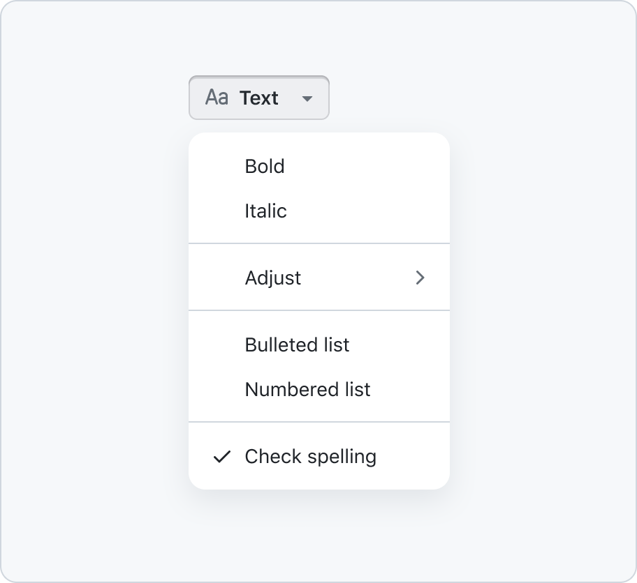
When one of the items doesn't have an icon then remove icons altogether.
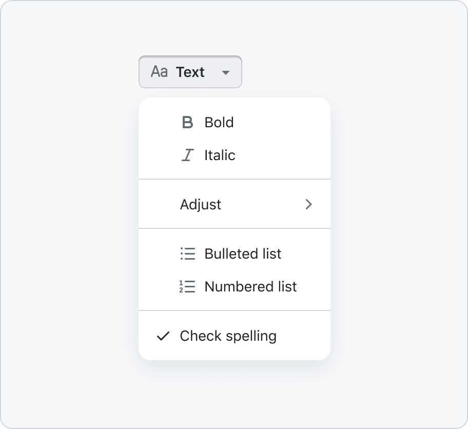
Don't mix items with or without icons as this makes it harder to read.
Especially when providing single or multi select items that rely on a crossmark icon should be avoided as they could be confused with the item's checkmark.
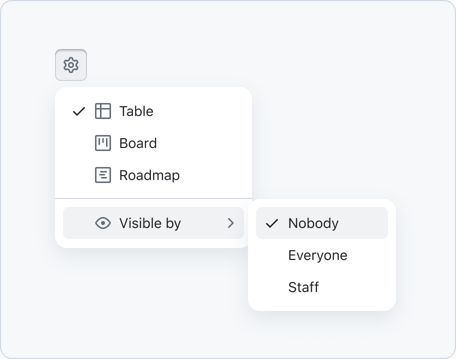
Avoid the usage of icons if the icon conflicts with the selected states checkmark.
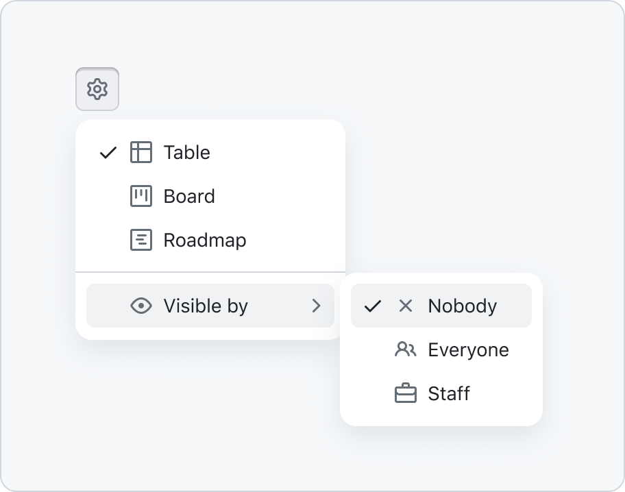
Don't use crossmark icons for single or multi select items.
Dividers
To enhance the readability of menus that contain numerous item descriptions, it is recommended to incorporate dividers. This can effectively prevent the menu from becoming overwhelming.
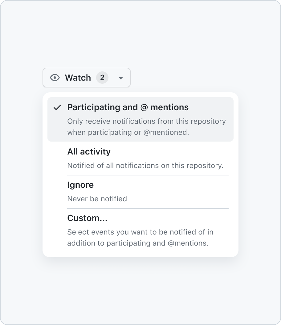
Introduce dividers for items with heavy descriptions to improve readability.
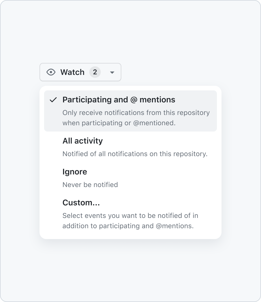
Don't forget to add dividers when the menu content starts to look heavy.
Trailing visuals
Avoid using trailing visuals to add additional interactions, which reserves them for submenu indicators or keyboard shortcuts.
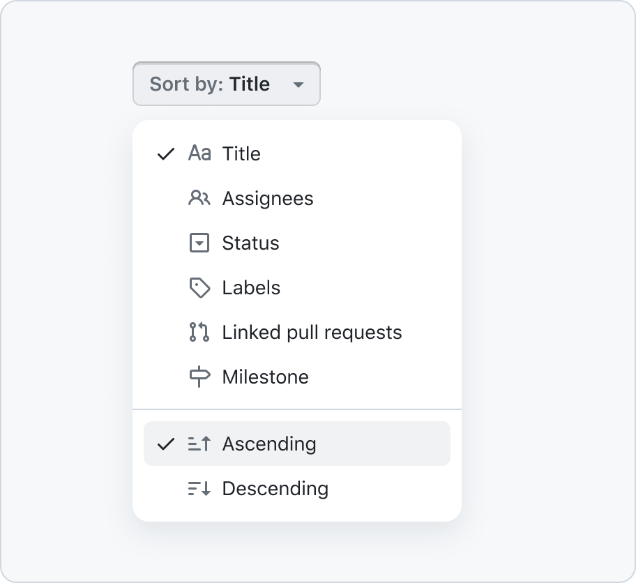
Create a new section for additional functionality.
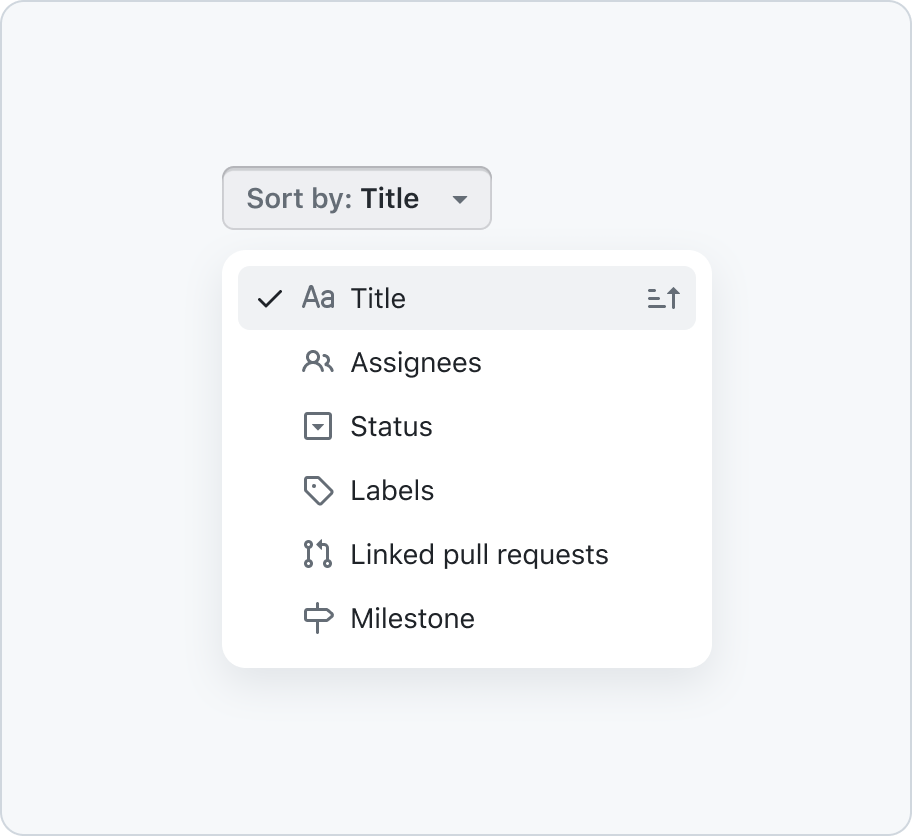
Don't store additional toggleable functionality in trailing visuals.
Multi-level
A menu with multiple levels is a common UI component used in desktop and mobile applications. It allows users to access nested subitems without cluttering the screen.
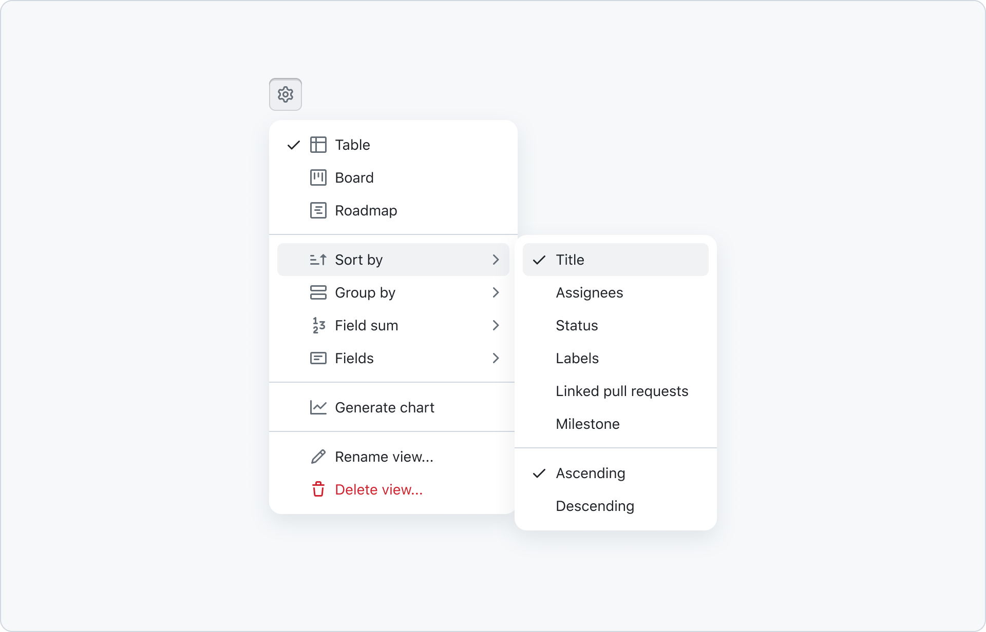
It's important to understand that menus can't include additional form elements like inputs. That means if you want to provide a input that filters the subitems that you can't rely on this component. Alternatively, you can use a select panel or open a dialog instead of a submenu.
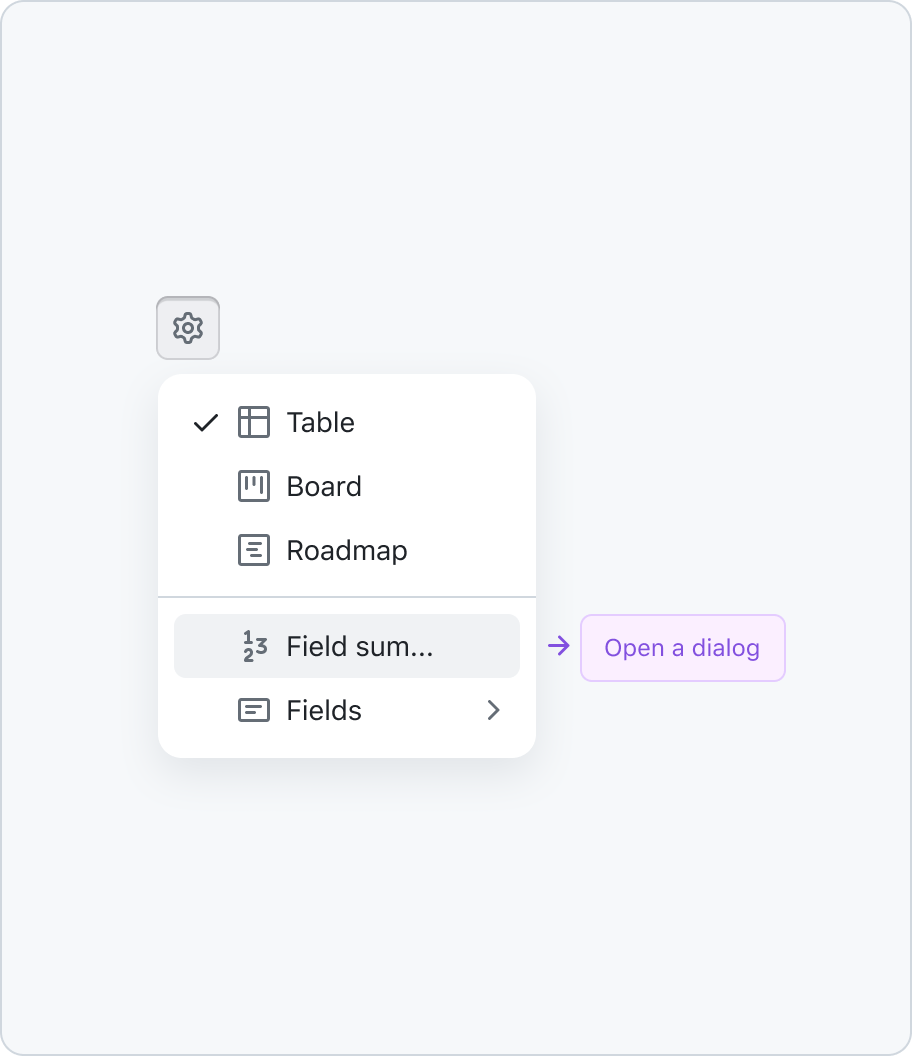
If you want to present filterable data open a dialog instead of a submenu.
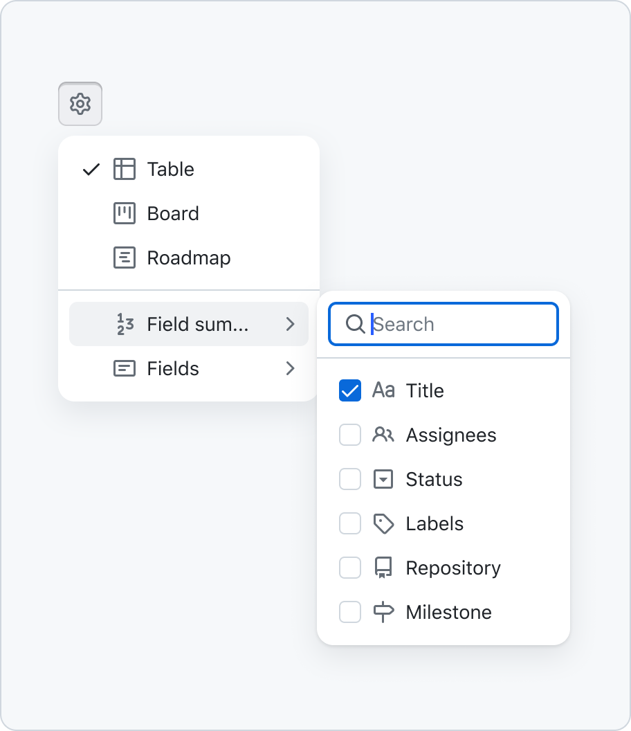
Don't use form elements inside a menu.
Since you can't include form elements within a menu that also means that you can't combine a select panel with a action menu.
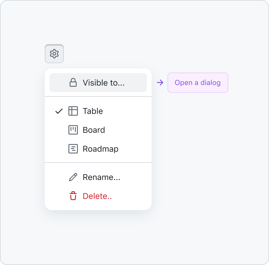
If you want to present filterable data do this through a dialog.
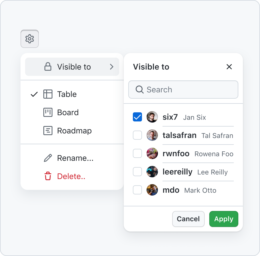
Don't mix select panels with action menus.
When using submenus, don't use the trailing visual to communicate selected values within its submenu. Leave this space for submenu indicators.
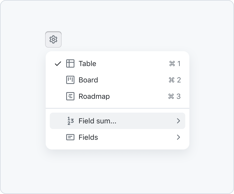
Use trailing visuals for submenu indicators or keyboard shortcuts.
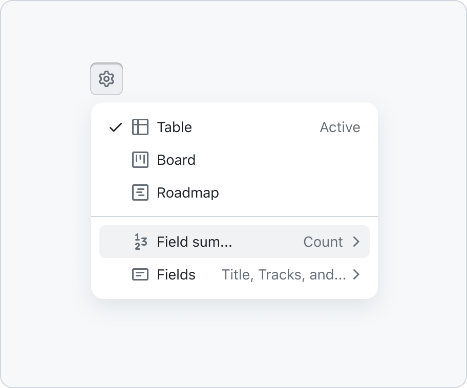
Don't use trailing visual to communicate selected items in submenus.
On smaller viewports, the menu should always be re-positioned to fit within the viewport. This could mean that a submenu overlaps it's parent menu.
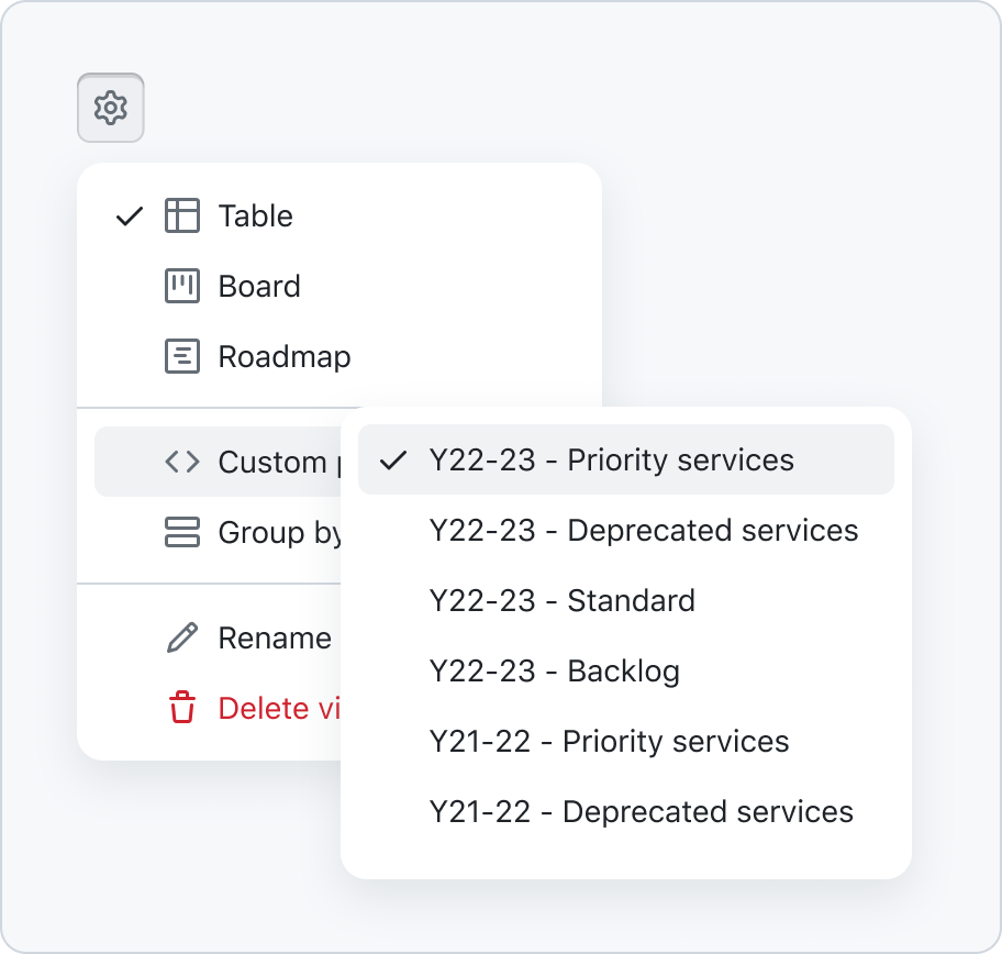
Reposition menus to stay within the viewport, especially on narrow viewports.
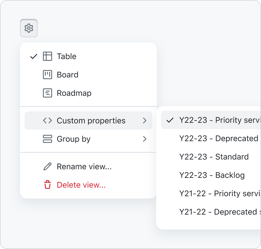
Don't position menus off screen, especially on narrow viewports.
Options
Trigger

Menus can be triggered through a button, icon button or right clicking list items. For simple select menus that display the selection in a button, a label must be persist either internally or externally.
Items
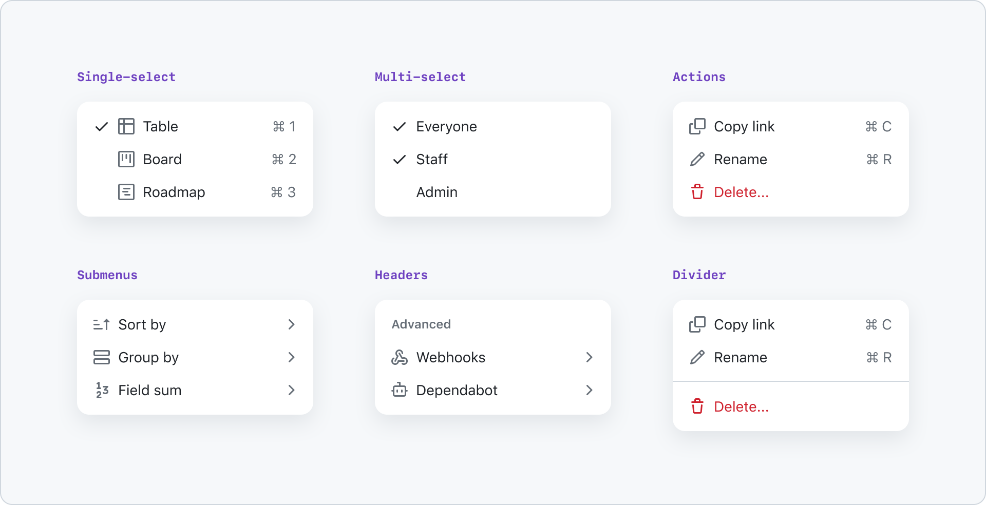
Here is an overview of action list items that are compatible with menus:
- Action: Triggers an action or dialog. Trailing visuals can be used for keyboard shortcuts.
- Single/multi select: Represented by a check and never a HTML checkbox. Trailing visuals can be used for keyboard shortcuts.
- Submenu: Represented by a chevron-right as a trailing visual.
- Section header: To add clarification to a section.
- Divider: To create sections for your selections, actions or submenus.
Inactive items
If items in a menu have been affected by a system error such as an outage, they may be put into an inactive state with a message in each item explaining why it's disabled.
If an action menu contains menu items that are very closely related (for example: the action menu for adding a file to a repo) and we can detect that none of the menu items are available, then put the button that triggers the action menu into an inactive state.
Inactive action menu items follow the same patterns as inactive action list items except:
- The message explaining why it's unavailable is renderd in the item, not a tooltip. Action menu items don't hide the message in a tooltip because the menu is already hidden until the user opens it.
- Hiding the message in a tooltip would require the user to do another interaction, and the UI could feel chaotic with so many layers.
- No alert icon leading visual is necessary since it would be redundant with the error message
Accessibility and usability expectations
When an ActionMenu is opened, focus moves to the first item in the menu.
Users can move between the different menu items – and, if present, submenus – using cursor keys.
If a keyboard user navigates away from an open ActionMenu using Tab / Shift+Tab, the ActionMenu is closed.
An open ActionMenu can be closed using Esc.
Menu items must have a clear and descriptive label. The label is the visible content of the button and will usually be text. The label should be concise and descriptive of the action that will be performed when the menu item is activated.
When using Octicons for leading and trailing visuals on individual menu items, note that icons don't have any text alternative. They are purely visual, and not conveyed to screen readers. Don't rely on these icons alone to convey meaning – make sure that the text label of the menu item provides sufficient meaning/context on its own.
Every menu item must have a minimum target size of 24×24 CSS pixels. This is to ensure that the button is large enough to be easily activated by users with motor impairments.
The currently focused menu item can be activated using Space or Enter. When a menu item is activated, the ActionMenu is closed, and the relevant functionality is executed. In the case of selectable menu items, the focused item is checked/unchecked, and the ActionMenu is closed.
When the ActionMenu is closed, focus returns to the most logical location in the page – in general, this is the trigger control that originally opened the ActionMenu.
See focus management for more information.
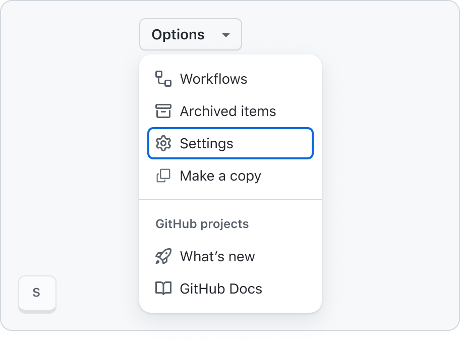
Menu mnemonics
When a menu is open, hitting a letter key for the first letter in an item to be selected will move focus to that item. If two items have the same first letter, the first item in the list will be focused first, and hitting the letter key again will focus the next item.Inactive menu items vs disabled menu items
Inactive menu items are still focusable and may execute actions, so they should not be marked as disabled using aria-disabled. For example, they might trigger a modal with information about an outage, which is still a valid action.
This behavior is consistent with the behavior of inactive buttons. See the button component accessibility guidelines and inactive button guidelines for more details.
Inactive menu items:
- Can be activated
- Need to be able to get focus so screen reader users can "read" the message about it being inactive
Disabled menu items:
- Do not get focus
- Cannot be activated
Built-in accessibility features
The component handles all aspects of focus management and keyboard interaction.
The role ("menu") and structure of the ActionMenu are correctly conveyed to screen readers – including the state of selectable menu items, and the correct association of grouped items with their group title/label.
Menu items meet the minimum target size requirement, 24px × 24px.
Keyboard navigation
Trigger button
| Key | Action |
|---|---|
| Enter | Opens the menu. |
| Space | Opens the menu. |
| ArrowDown | Opens the menu. |
| ArrowUp | Opens the menu. |
| ArrowLeft | Opens the menu. |
| ArrowRight | Opens the menu. |
Menu items
| Key | Action |
|---|---|
| ArrowUp | Cycle through items starting with current item to previous item |
| ArrowDown | Cycle through items starting with current item to next item |
| ArrowLeft | Closes submenu and sets focus back to the parent item |
| ArrowRight | Opens a submenu |
| Enter | Triggers the focused item |
| Space | Triggers the focused item |
| Home | Move focus to first item |
| PageUp | Move focus to first item |
| End | Move focus to last item |
| PageDown | Move focus to last item |
| Esc | Close menu |
Implementation requirements
The ActionMenu allows the use of inactive controls – controls that can still be focused, and even activated (for instance, to trigger an informative modal dialog informing the user why a particular item is marked as inactive). Currently, this state of a menu item is not conveyed programmatically, meaning that screen readers won't announce that an item is inactive. Make sure to include descriptive inactiveText to an inactive menu item, to clearly explain the status of the item to all users – and in particular, screen reader users, who won't otherwise be informed of the fact that an item is inactive.
How to test the component
Integration tests
- The menu items have sufficiently descriptive labels
- If menu items include icons for their leading or trailing visuals, the purpose of the items is clear even without the icons (as these are only decorative and are not conveyed to screen reader users)
- When using an
inactivemenu item, provide a descriptiveinactiveTextthat explains why the item is inactive
Component tests
- The component exposes an appropriate set of
role,aria-*attributes, and overall structure in its rendered output:- the component itself has a
role="menu" - each item within the menu has a
role="menuitem",role="menuitemcheckbox, orrole="menuitemradio - when items are grouped into sections, each section is identified using a container with
role="group, and the group has an accessible name (either usingaria-labelor referencing an existing element witharia-labelledby) that matches the visible section label - selectable items have an
aria-checkedattribute, and correctly reflect their state (aria-checked="true"when checked,aria-checked="false"when not checked)
- the component itself has a
- When a menu is opened, focus moves to the first menu item
- The correct keyboard interactions have been implemented
- The menu can be closed using
Esc - When moving keyboard focus away from the menu (using
Tab/Shift+Tab) the menu is closed - When a menu item is selected, the menu is closed
- When the menu is closed, focus is programmatically moved back to the most appropriate element in the page – in general, the trigger element that opened the menu; this does not apply when the menu was closed as a result of a keyboard user explicitly navigating away from the menu (using
Tab/Shift+Tab) - When a menu item is
disabled, the item hasaria-disabled="true", but still receives focus - When a menu item is
inactive, the item still receives focus
Refer to the W3C ARIA Authoring Practices Guide for menu button and actions menu button.