Primer Design System
Site navigation
On this page
Overview
Users should be able to resize text and use custom text spacing without text being clipped, truncated, or obscured. In addition, interactive controls should not break.
Why?
People with low-vision may rely on the browser's zoom functionality or update the font-size of a page to read content. Additionally, people with low-vision and people with dyslexia may increase text spacing with custom CSS to improve readability.
When sites are built without adequate considerations around responsiveness (for example: setting fixed width and height, using non-relative font sizing), sites may become completely unreadable and unusable for some users.
How to test
Text resizing
Most modern browsers support full-page zoom, while some also support text-only zoom (for example: Firefox). While WCAG does not specify how text should be resized, it is best practice for your page to be readable with full-page zoom and text-only zoom. Aside from using the browser zoom, some users may also resize text through browser font-size setting.
Test your page by using browser zoom with magnification of up to 200%. Confirm that the text content does not overflow, overlap, or become truncated, and that interactive controls still work.
Learn more about resize testing techniques at TheA11yProject: Resize text.
Text spacing
Modify text spacing according to the WCAG text spacing testing guidelines. You can do this by changing the CSS using the browser inspector or by using a tool like Steve Faulkner: text spacing bookmarklet.
Confirm that text is contained within the bounds of its container without overlapping or being cutoff.
Guidelines
For designers
When creating a design, ensure that font sizes and element sizes are annotated with proper resizing techniques before handing it off to an engineer. There are a variety of techniques that
can be employed to ensure responsive text and space resizing. This includes avoiding setting fixed height on a container to allow text content to expand, and using relative units such as em and rem instead of px.
Learn more about the techniques at: WCAG Resize text techniques and WCAG Text spacing techniques.
For engineers
As you're developing a feature, make sure to test the page using the resize techniques described in How to test. Ensure that WCAG Resize text techniques and WCAG Text spacing techniques are employed.
Examples
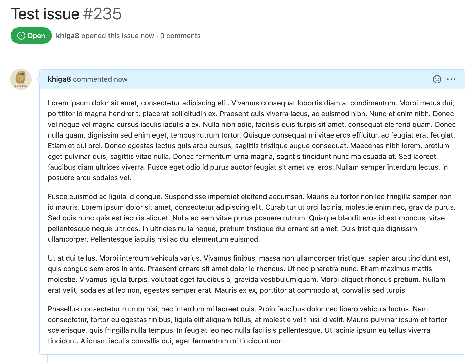
Do ensure that the text does not overflow when text spacing is customized

Do use the browser zoom functionality to verify that the page is readable and functional, and make adjustments if necessary

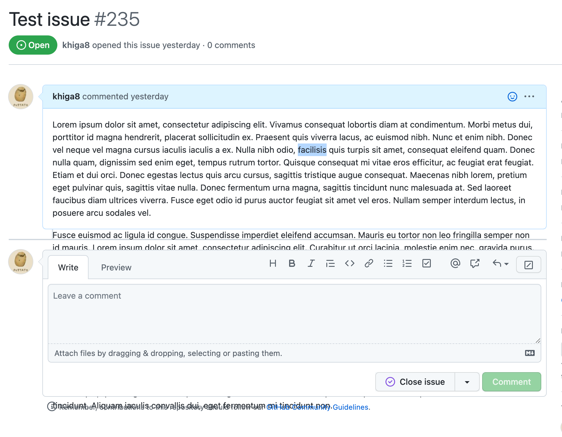
Don't use a fixed height on text content containers. In the image below, the fixed height of the container causes text to overflow out of bounds.
