Relative time
Relative time displays time in a way that is clear, concise, and accessible.
On this page
On this page
Overview
All dates and times displayed should use the relative time component, which is able to format and localise dates into the users given locale, as well as display times relative to the current date, while also updating in real-time.
Dates and times almost always appear relative to the current date, using short-hand formats to help users quickly determine how old something is or how soon something will be. For this, we use the relative time component which displays dates rounded to the nearest unit, for example, "a minute ago" or "20 days ago". For dates that are more than 1 month from the current date, it can be more useful to display the date-time, as these items are less "current" and more "historical".
Some dates are especially sensitive and always should be displayed in a precise date-time format, such as the creation or expiration of certificates and keys. When a user needs to take action before a particular time (such as an expiry date) then the precise date time should be displayed. These should display the weekday, the date, the month, and the year (if the year is not the current year), for example, "Thursday, 26 August 2021" or "Saturday, 31 December 2022".
Some dates and times represent the start or (expected) end of an actively running task, for these the elapsed or remaining time should be displayed, as this information is more useful than when a task started. This format should display all units that are greater than zero, for example, "2 minutes, 24 seconds" or "8 hours, 15 seconds". For ephemeral tasks where timing needs to be quickly consumed, or where a lot of times may be displayed together, a compact time notation can be used, for example, "2m 24s" or "8h 15s".
Usage
This component does not include any styling. It formats a timestamp as a localized string or as relative text that auto-updates in the user's browser.
Options
Relative dates
Past dates
For past dates, the relative time component outputs different formats depending on the time difference. Within a month's time, the output shows a relative time1 in the format of X seconds/minutes/hours/days ago. If the time difference is less than 1 minute, it shows just now. If the date is in past months, the date time2 format on D MMM is used. If the date is in the past years, the output uses the long format3.
| Time difference | Format | Examples |
|---|---|---|
| < 1 minute | just now | just now |
| < 1 month | X seconds/minutes/hours/days ago | a minute ago, 5 minutes ago, an hour ago, 3 hours ago, yesterday, 20 days ago |
| > 1 month | on MMM D | on Nov 18 |
| Past year | localised | on Nov 18, 2021 (US English), on 18 Nov, 2021 (British English), on 2021 Nov 18 (Korean) |
Future dates
Future dates also use different formats depending on the time difference. If the future date is due to happen within the a month's time, the relative time outputs the format of in X seconds/minutes/hours/days. If the time difference is less than 1 minute, it shows just now. If the date is in the following months, the format on D MMM is used. If the date is in the next year or further, the output uses the long format3.
| Time difference | Format | Examples |
|---|---|---|
| < 1 minute | just now | just now |
| < 1 month | in X seconds / minutes / hours / days | in a minute, in 2 minutes, in an hour, in 7 hours, tomorrow, in 14 days |
| > 1 month | on MMM D | on Nov 18 |
| Next year | localised | on Aug 26, 2025 (US English), on 26 Aug, 2025 (British English), on 2025 Aug 26 |
Standalone
The relative dates can be used within a sentence, following the action that it's relative to, or as an independent elements when the content and the surrounding elements make it clear what the time is related to.
Use standalone relative dates on items where its title references the action.

Use standalone relative dates a timeline item where the section title references the action.
Links
The relative dates are used as plain text in most cases. However, they can be used to point to a list of historical changes, a timeline, or as an anchor link for nested information in a view. For example, a date could be used to link to a comment in a conversation thread.

Responsive design and micro format
Relative dates must remain readable and accessible in different screen sizes. We encourage to use long date formats (e.g. 2 months ago) instead of the micro format (e.g. 2mo) on mobile screens or narrow spaces, as it can be difficult for users to understand, it doesn't support browser translation, and causes issues with assistive technologies. For example, some screen readers, such as VoiceOver for mac, will read out 1m as 1 meter.
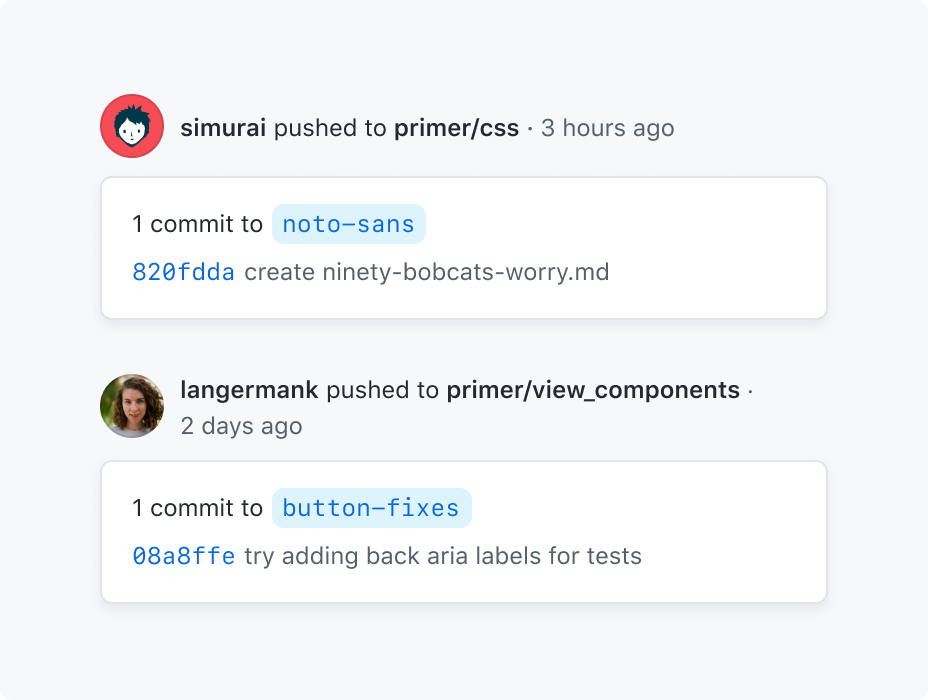
Use readable, long date formats, and adapt the layout to the available space.
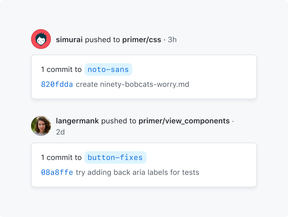
Don't use narrow date formats, specially if there's a prominent space available or the layout can be adapted to the screen size.
Precise dates
For dates that needs to represent a precise date and time which the user should be aware of, dates should be displayed in a precise format that includes the weekday, date, month and if appropriate the hours minutes and seconds. This will take the format of weekday, MMM D, YYYY, HH:MM:SS [AP]M. The placement of these items may be different depending on locale.
Use precise dates for future relevant dates.
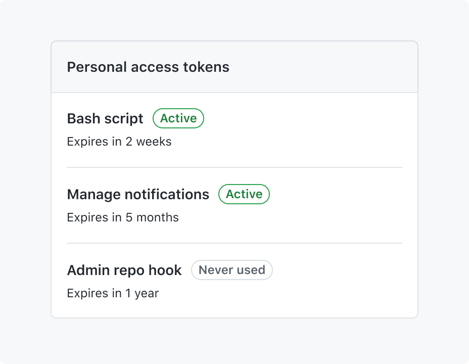
Don't use relative dates for future specific dates.
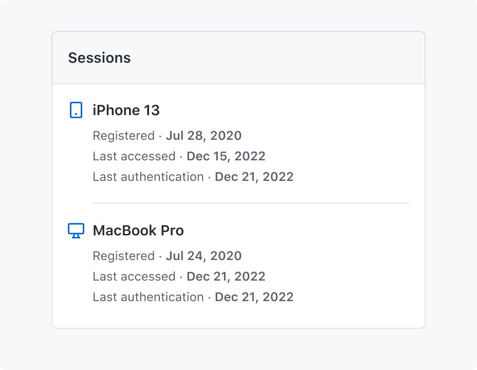
Use precise dates when the user needs to know the exact time of past dates.

Don't use relative dates for past specific dates.
Elapsed or remaining dates
For dates which represent the start or (expected) end of a currently running task or job, it is more useful to display the elapsed time since the task began, or remaining time until the task ends. This takes the long format of X years, X months, X days, X hours, X minutes, X seconds or the compact format of Xy Xm Xd Xh Xm Xs. Any 0 values will not be displayed. For some tasks where the expected end time is further away and second precision is not needed, it may be useful to display less precise data, such as down-to-the-day, taking the format of Xy Xm Xd.
| Precision | Format | Examples |
|---|---|---|
| second | Xy Xm Xd Xh Xm Xs | 4s, 5m 32s, 1d 4h 32s |
| day | Xy Xm Xd | 2y 3m, 2y 8m 5d, 2m 2d, 1y 4d |

Use elapsed dates to represent the duration of a single or multiple running tasks.
Word formatting
By default, the time will be prefixed with "on", but this can be customized.
Weekday names and month names are fully written out by default, but they may be abbreviated.
Number formatting
Any part of the time can be rendered with or without a leading zero.
Accessibility and usability expectations
This component is intended to show a shorter, more user-friendly relative time (for instance, "3 hours ago", "20 Sept"), with the option for the user to still see the precise localized date/time.
Built-in accessibility features
The component renders text showing the chosen relative time (for instance, "1 week ago"). By default, it renders with a title attribute containing the precise localized date/time. Doing this triggers a native browser tooltip when the component is hovered with the mouse. This means that by default, the component is not accessible to keyboard users, as there is no browser-native mechanism to show title tooltips when navigating with a keyboard. See the Implementation requirements section for guidance on making it accessible.
When using a screen reader, title is usually announced as an additional description for specific elements, such as form controls, links, and dialogs. However, as the <relative-time> component is a custom and semantically neutral element, screen readers only announce the visible text and ignore the title attribute content, making the precise localized date/time not available to screen reader users by default.
Implementation requirements
Due to the current limitations of this component, one should consider alternative ways to expose the precise localized date/time to all users rather than only relying on the component's title attribute tooltip alone.
The specific way to achieve this will depend on the context of what you are building. For instance, you could use <relative-time> on an initial listing or overview page, but then provide the full localized date/time in a subsequent details view, or in a dialog that shows more information for an individual item. Alternatively, provide a toggle or user setting that allows users to switch all instances of relative time to the full localized date/time display.
General recommended approaches are:
- For interactive elements (such as using a link), use an accessible Primer Tooltip with the
<relative-time>component to display the full date/time and hide thetitleattribute. See the React 'Link with tooltip' story and the Rails 'Link with tooltip' preview for implementation examples. - For static elements, consider using the full date/time by default and hiding the
titleattribute.
How to test the component
Integration tests
- Whenever the shorter relative time is presented to the user, there is a way for users to see the precise localized date/time as well. This method must work for all users – including keyboard and screen reader users.
Known accessibility issues (GitHub staff only)
View open accessibility issues related to this component- Relative time data is derived from the Intl.RelativeTimeFormat API.↩
- Date time data is derived from the Intl.DateTimeFormat API.↩
- The long format output depends on the user agent's timezone. For example, it will be
on MMM D, YYYYfor US English that uses month-day-year order,on D MMM, YYYYfor British English that uses day-month-year order or evenon YYYY MMM Dfor Korean that uses year-month-day order.↩