Data table
Data table is a 2-dimensional data structure where each row is an item, and each column is a data point about the item.
On this page
On this page
Anatomy
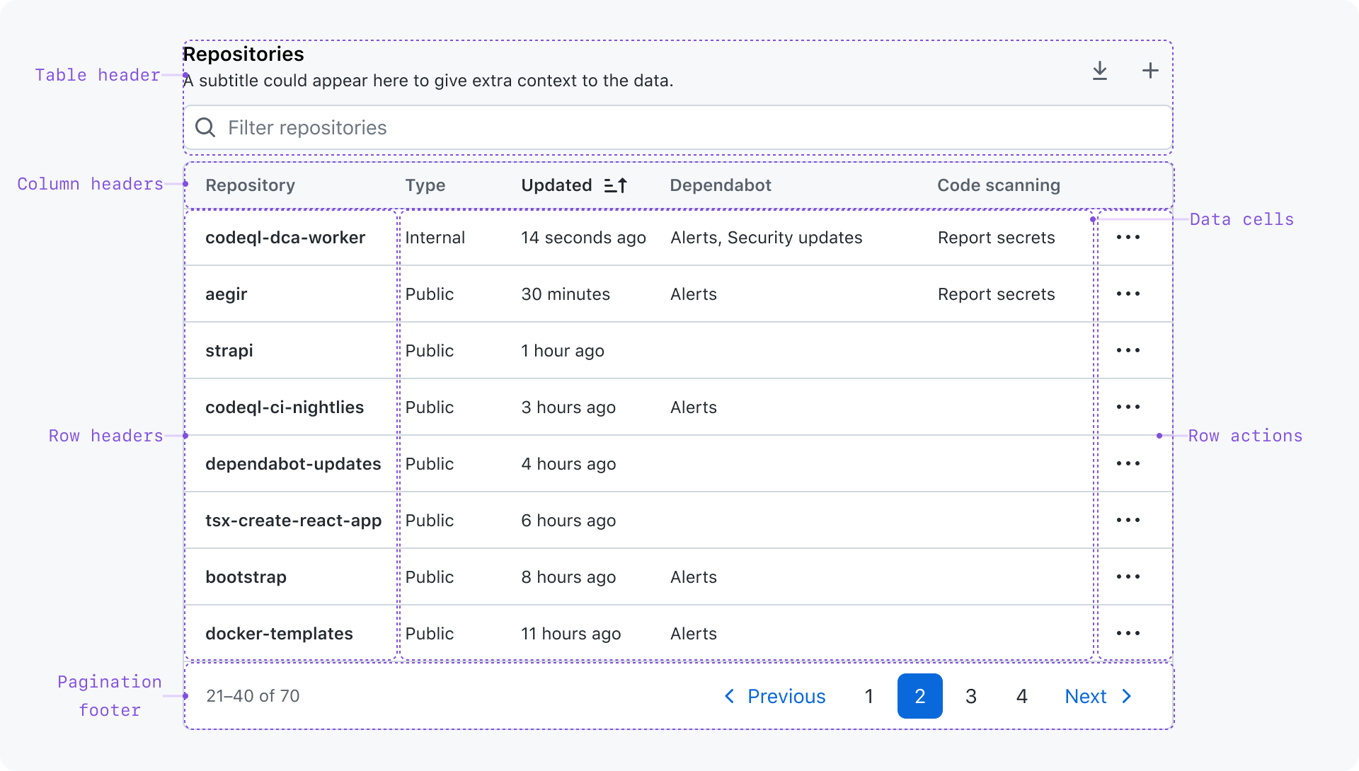
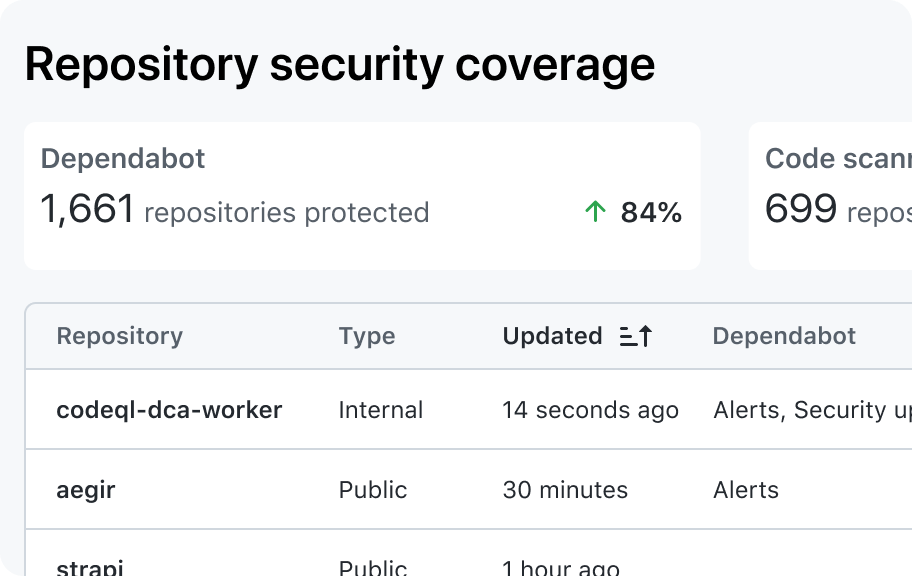
Table header
The table header shows contextual information about the table and render controls that affect the table.
- Title: A concise label that describes the table and its contents
- Subtitle: A brief description to adds more context for the table when the title alone is not enough
- Actions: Controls that affect the entire table
- Filter: An input used to filter table data to make it easier for the user to focus only on the rows relevant to their task. Even though the filter affects the entire table, it's not considered an "action".
Column headers
A very short label that describes the data in the column.
Column headers are buttons that sort rows by the column data in ascending or descending order. Sort functionality may be disabled on a column-by-column basis.
The column that contains row actions does not have a visible column header.
Row headers
A row header identifies the item being represented in the row. They are typically the first cell in the row, and are visually distinct from the other cells in the row.
Row actions
Actions that affect the item represented in the row.
Data cells
The data for each row that is described by its corresponding column header and optional row header.
Pagination footer
The pagination footer shows the user where they are in relation to the total number of rows and provides controls for navigating all rows.
Usage
When to use a data table
- To navigate a lot of information at once and to make it easy to compare data points between rows or columns
- If the data is easy to understand when all data points are displayed in a flat hierarchy
When to use something else
Use a list or something else
- When there are columns where the cells will usually be empty
- If the data is easier to understand with grouping and hierarchy (sections, headings, subheadings, etc.)
- When rows and columns are only a means of layout
- For data with longform content such as paragraphs or long lists
Use a data grid
- If the primary purpose is to edit or otherwise interact with the cells (like a spreadsheet)
- If rows or columns support some kind of user interaction
Best practices
Order rows intuitively
Data should be initially rendered in an intuitive order. For example, starting with the most recently created items.
By default, sort alphabetically by the first column's content. Rows will be re-ordered as the user updates the sort parameters
Minimize the number of columns
It's easier to scan many rows than it is to scan many columns. Consider swapping columns and rows when it's unlikely that there will ever be more rows than columns.
Adapt column widths when necessary
Use the column width options to appropriately size the columns depending on the content and the available horizontal space.
Keep column headers short
Column headers are short labels used to define the kind of data that is shown in that column.
Keep cell content concise
Cells should represent data in the shortest possible format. This makes the table easier to scan, and preserves horizontal space.
Don't use a single column to show multiple pieces of data
The column header should accurately represent the data point rendered in the column's cells. It would also be unclear which data point is being used when sorting.
Make numbers easier to compare
Right-align numeric values and use the tabular-num font variant when possible.
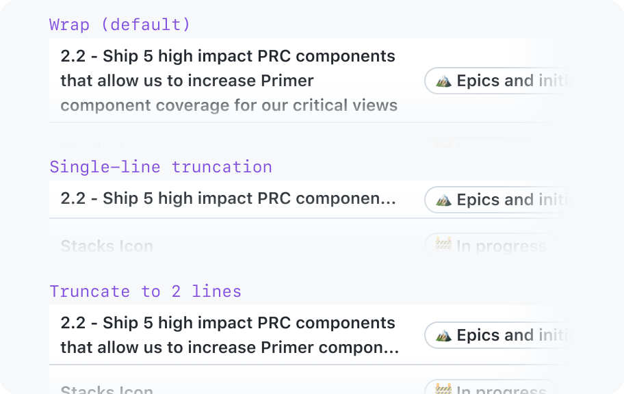
Avoid wrapping or truncation of cell content as much as possible
Ideally, the cell content is very short and the column will be wide enough to accommodate its content. In cases where it's not possible to fit the content, you may wrap or truncate the content.
Cells that are likely to contain long strings may choose to wrap the content. This is the preferred way to accommodate long content because it doesn't hide the content.
Content truncation is available as a last resort when column widths are set. The full content may be exposed in a tooltip.
By default, leave empty cells blank
You may show a message to explain an absence of data. Just don't use a character like “x” or “-”. It creates a weird experience for assistive technologies like screen readers.
Use “skeleton” placeholders to indicate loading content
The placeholder should match the real content as closely as possible.Use the following properties to adjust the size and alignment of the placeholder:
- column width
- alignment
- whether or not there is a leading visual
Don't worry about whether the text wraps. Ideally, the height of the cell will not change once the data is loaded. However, it wouldn't be possible to know how many lines of text the content wraps to.
Use pagination to accommodate tables with a large dataset
By paginating, the user can focus on segments of a large dataset without being overwhelmed. Pagination also helps with performance by reducing the amount of data to be downloaded and the amount of content that needs to be rendered.
Don't put too many or too few rows per page
If page length is too short, it would be annoying to browse the data in small segments. If page length is too long, users could get lost or overwhelmed.
The following factors influence what the ideal page length would be for your use-case:
- Whether rows can be filtered
- Number of columns
- Visual complexity of the rendered cells
- Amount of context needed when reviewing the data
These factors make it difficult to recommend an “ideal” page size for all use cases, but 20 rows is a good place to start.
Communicate when the table has no data to show
Show a Blankslate component in place of the table
Consider small screens
Some strategies for adapting the table for narrow viewports include:
- Use the column width options
- Remove less important columns
- Scroll horizontally
Do's and Don'ts
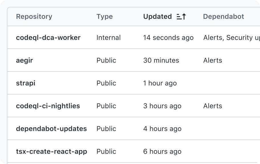
Use a data table for data in a flat hierarchical structure
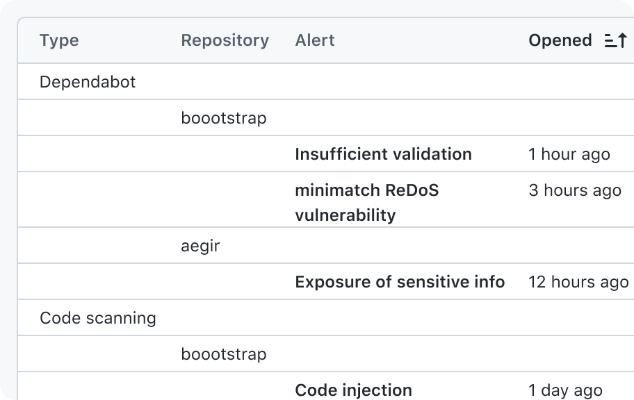
Don't use a data table for information that has hierarchical relationships

Restrict the data in a column to represent one type of data
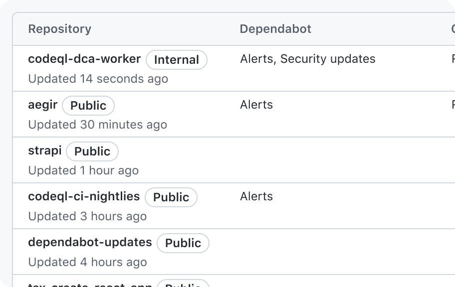
Don't group data in a column cell that isn't described by the column header
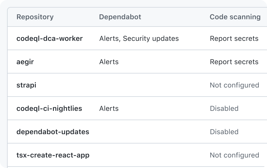
Leave the cell blank (preferred) or show text that explains the absence
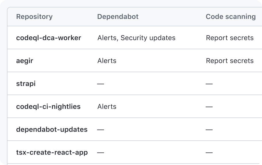
Don't show a character, icon, or emoji to indicate a cell is empty
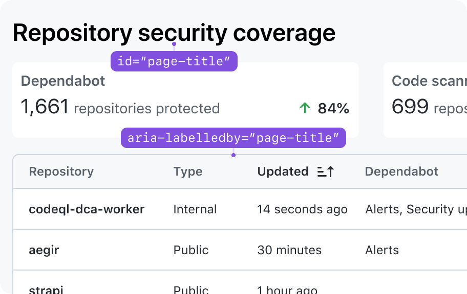
Allow the title in the page header to act as a table title when appropriate
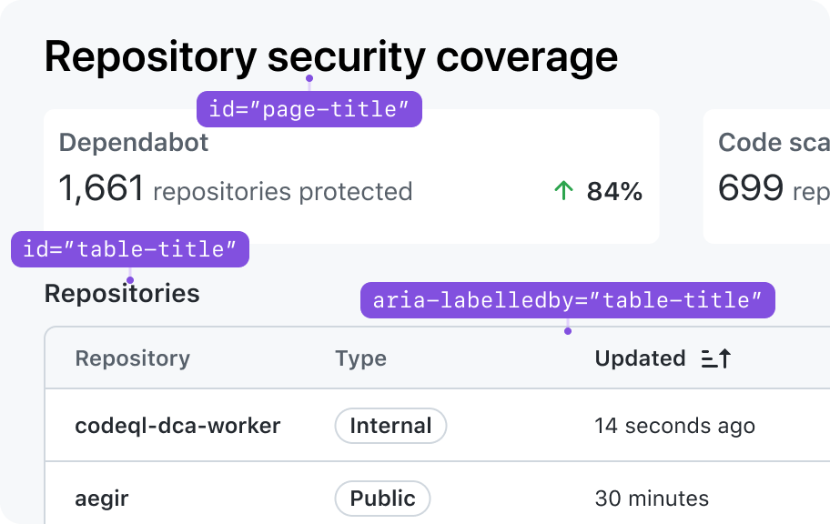
Don't repeat or rephrase the title in the page header as the table title
Options
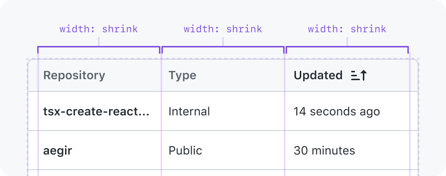
Column widths
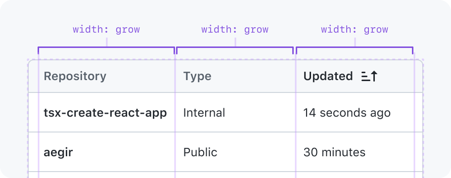
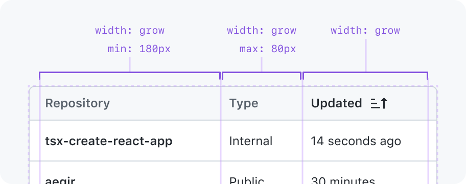
Grow (default)
Stretch to fill available space, and min width is the width of the widest cell in the column. This is the same behavior as a CSS grid column with the value minmax(auto, 1fr).
May have a min and max width constraint.
Grow or collapse
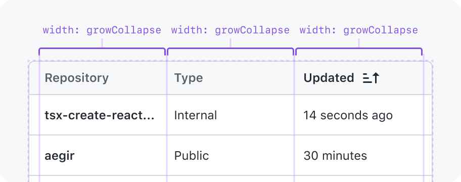
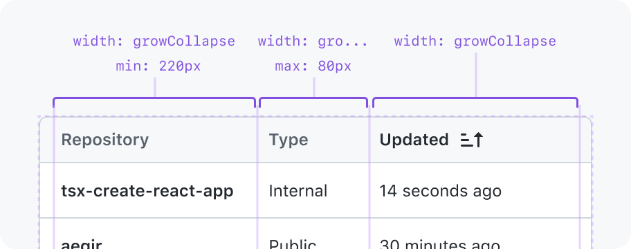
Stretch to fill available space in the parent or shrink to fit in the available space in the parent.
May have a min and max width constraint. Without a min width constraint, the column could collapse to a width of 0px.
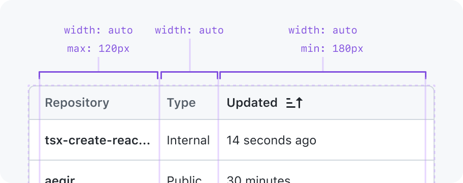
Auto
The column is the width of its widest cell. Not intended for use with columns whose content length varies a lot because a layout shift will occur when the content changes.
May have a min and max width constraint.
Explicit width
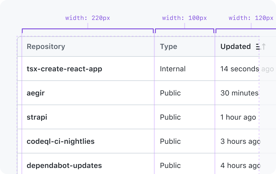
Will be exactly that width and will not grow or shrink to fill the parent.
Action column
The action column would not accept a width. Its min-width would be the width of the actions.
Filling available space
If all columns have width constraints set and the row doesn't fill the table container, the difference is added to the width of the last column.
Cells
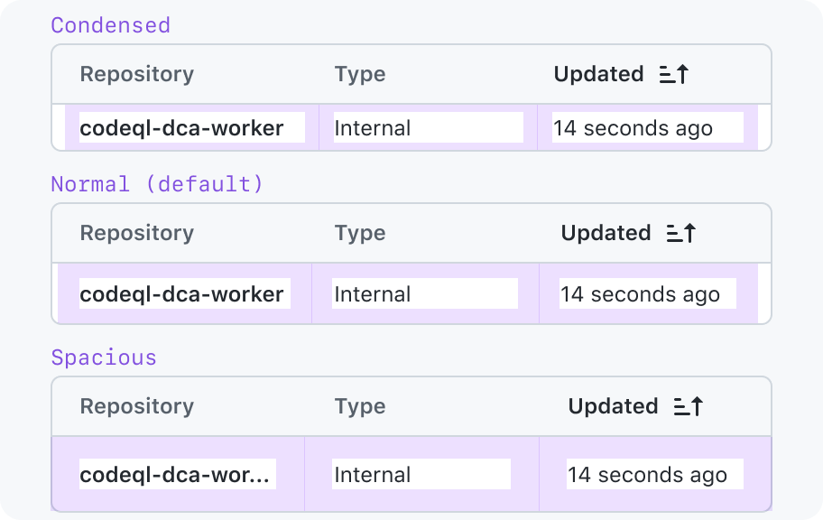
Density
Options:
- Condensed: Optimize for showing more information in a smaller area.
- Normal (default): Shows a lot of information in a small area, but provides enough whitespace that the cells won't risk visually running together.
- Spacious: Optimizes readability for tables with visually busy cell content.
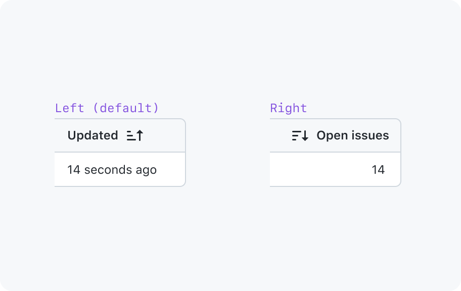
Text alignment
- Left (default): Matches natural reading direction of text in right-to-left writing systems.
- Right: Optimizes for comparing column data that is easier to compare when it's right-aligned. Most commonly used for numeric data.
Content fitting
- Wrapping (default)
- Single-line truncation
- Multi-line truncation
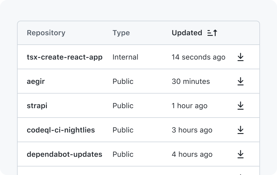
Row actions cell options
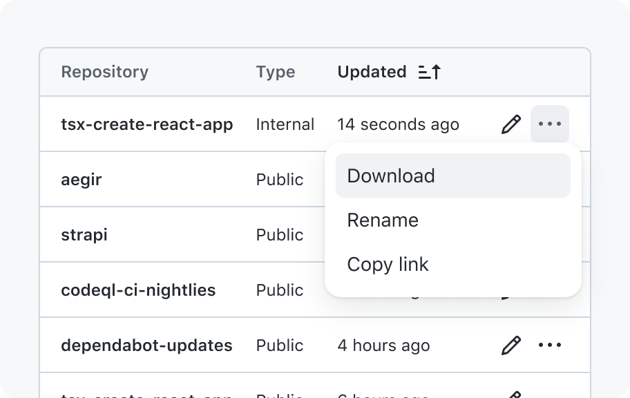
1 action
Row actions are placed in the last column, and they don't require a visible column header.
Multiple actions
If you have multiple actions for a row, start by pulling them into a dropdown menu.
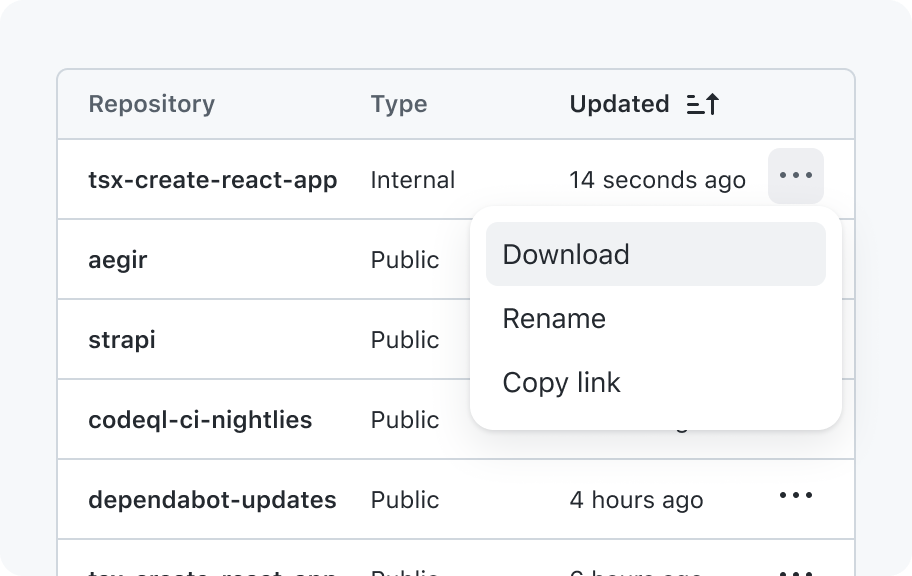
1 primary action, other actions in an overflow
If one of the actions is heavily used, pull it out for easier access. Do not pull out more than 1 action.
Interactions
Sorting
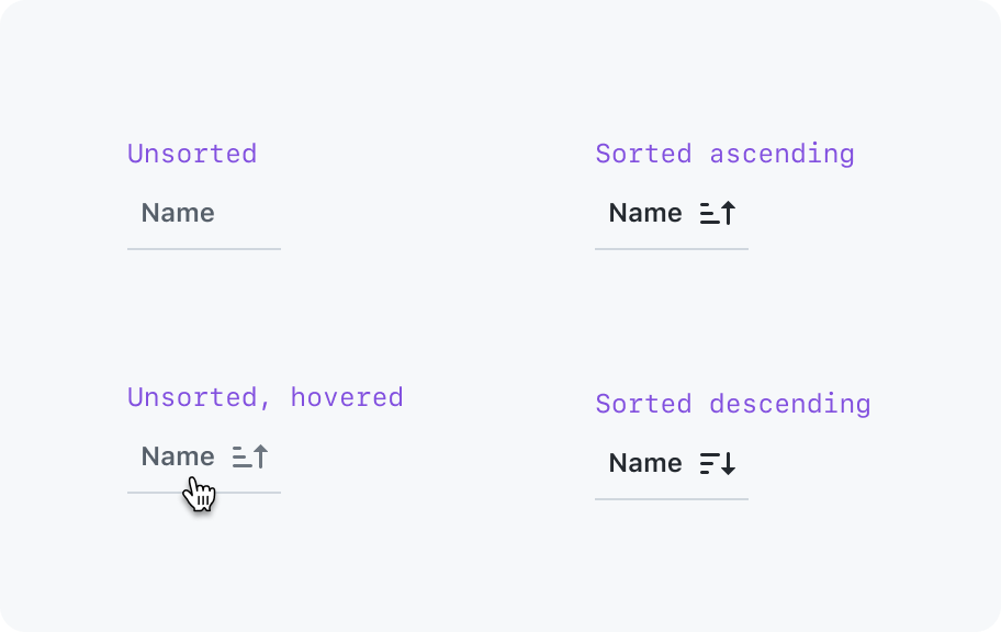
If a table is sortable, it must start with one column sorted on page load. Interacting with a column that is already sorted will toggle the sort between ascending and descending. If a column is not sorted yet, the first click sorts in ascending order.
States
- Unsorted (default)
- Ascending sort active
- Descending sort active
- Sort in progress
Filtering
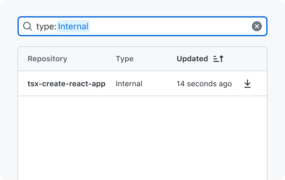
A filter input (internal) is used to write a query and only show rows that match that query.
Accessibility
Labeling and describing the table
The table must have a title, and can optionally have a subtitle to describe more context. If you encounter a case where there is enough context that the table doesn’t need a visible label, you may hide it so it’s only accessible to assistive technologies.
If you use the table header, the table's title and subtitle will automatically be associated with the table for assistive technologies.
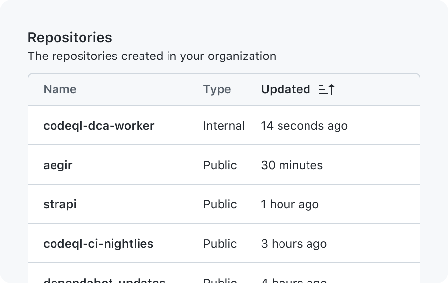
If your table's title exists somewhere else on the page (for example, in the PageHeader), then you must manually associate that contextual information with the table using ARIA.
Labeling actions
The row header string will be prepended to the ARIA text of action buttons. For examples, Download {row header}“, “Actions:{row header}”
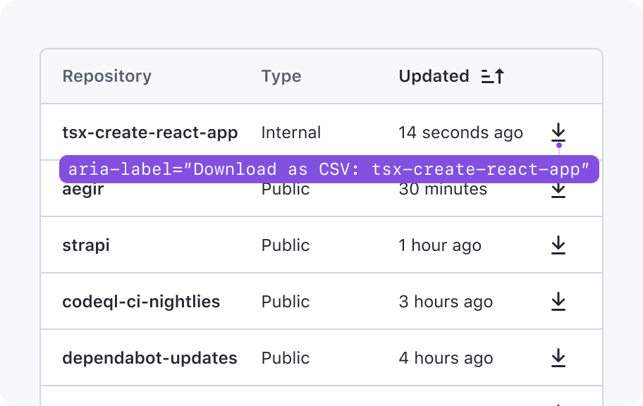
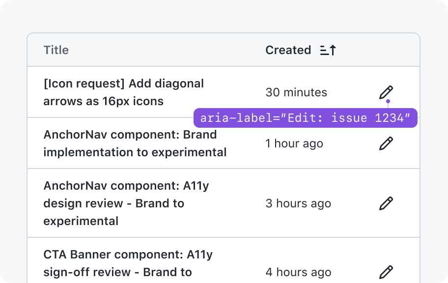
To handle cases where the row header can be very long, we should give consumers the option to specify a shorter string to identify the rows. For example, if an issue title is used as the row header, we could use the issue number instead of the full issue title.
Pagination buttons
The pagination control for a DataTable uses button elements, and not a elements. This is because activating the pagination control requests data, and does not have a corresponding URL to link to.
Loading and sorting content
It is important to ensure parity between what can be seen visually when a table is loading or sorting content and what is announced to assistive technology. This is provided by the DataTable component automatically, but must be considered if a custom loading solution is otherwise utilized. For loading content via a custom loading method, this also includes the initial loading period. An announcement should not be made if content is retrieved before 750ms.