Primer Design System
Site navigation
On this page
Overview
Headings play a critical role in communicating the structure of a page. Heading levels range from <h1> to <h6>.
Best practices
- Avoid skipping heading levels.
<h1>should be followed by<h2>and so on. - Do not use heading elements solely for resizing text.
- Avoid setting more than one
<h1>per page.<h1>should be reserved to describe the page as a whole, similar to a page<title>. (Dialog headings are excepted from this rule.)
Why?
A correct heading structure is critical for enabling users to navigate quickly within a page. Headings are by far the most common navigation technique for screen reader users. 67.7% of surveyed screen reader users responded that they are first likely to navigate via the headings when trying to find information on a lengthy web page. A proper heading structure also allows sighted users to visually scan and find what they want on a page quickly.
An improper heading structure can cause a confusing navigation experience.
Guidelines
For designers
In your designs, annotate the heading level. Properly labeled headings are one of the most important things a designer can do for developer handoff.
For engineers
As you're developing a page, use tools like Accessibility Insights and HeadingsMap to verify the heading structure. You may also inspect the DOM structure of your page using the browser inspector, but using an extension will surface heading levels more easily.
Examples
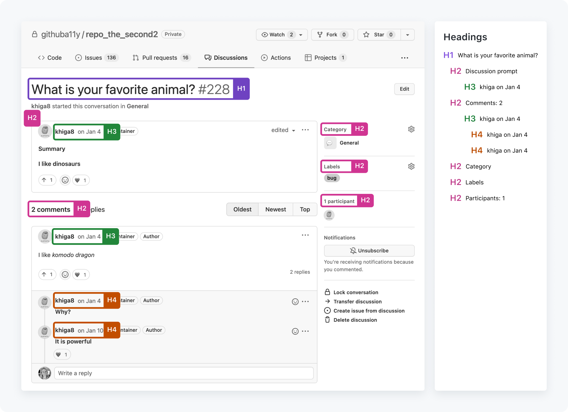
Do follow a clear heading hierarchy

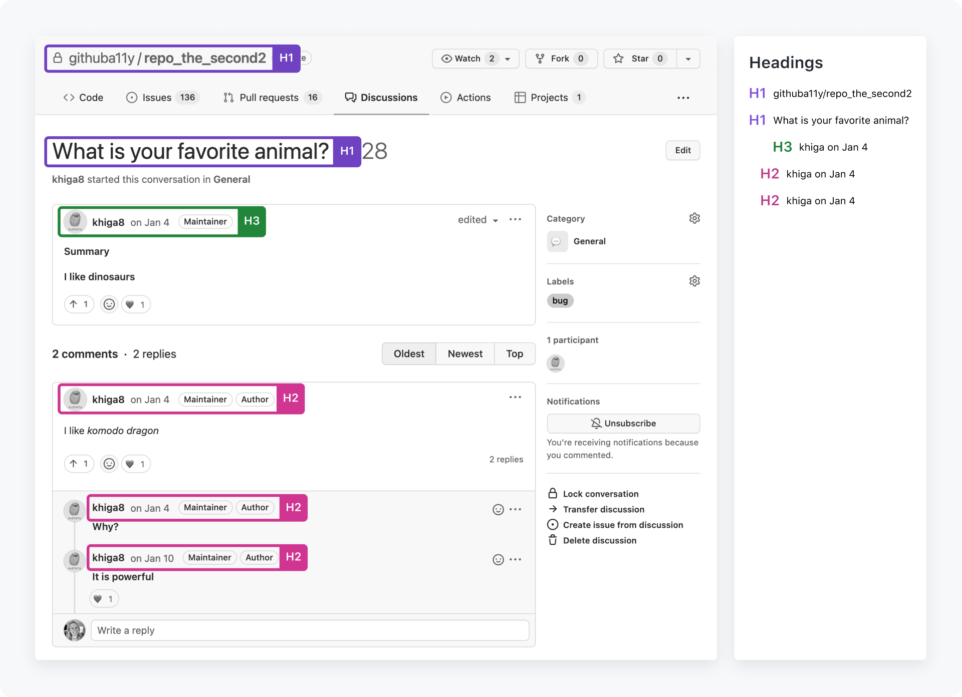
Don't use multiple h1s, skip over heading hierarchy for visual effect, or forget to label sections of information with headings
